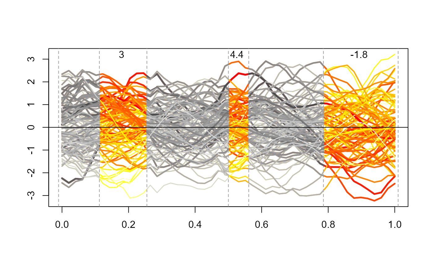
Provide a graphical representation of the functional data with a focus on the detected periods with the Bliss method.
interpretation_plot(data, Bliss_estimate, q = 1, centered = FALSE, cols = NULL)Arguments
- data
a list containing:
- y
a numerical vector, the outcomes.
- x
a list of matrices, the qth matrix contains the observations of the qth functional covariate at time points given by
grids.- grids
a list of numerical vectors, the qth vector is the grid of time points for the qth functional covariate.
- Bliss_estimate
a numerical vector, the Bliss estimate.
- q
an integer (optional), the index of the functional covariate to plot.
- centered
a logical value (optional), If TRUE, the functional data are centered.
- cols
a numerical vector of colours (optional).

